
Buttons & CTAs
Buttons are one of the most frequently used components across the applications I’ve worked on. They guide users through actions such as applying filters, submitting forms, downloading reports, and navigating to the next step. A clear hierarchy, accessible sizing, and consistent placement were essential to ensure these actions felt intuitive across both desktop and mobile.
Decision & Rationale
1) Primary action & secondary action buttons
-
Designed distinct styles for button hierarchy: Primary actions use a solid blue background with white text, while Secondary actions use a blue border with white background and blue text.
-
Ensured accessibility by setting minimum button dimensions of 44×44px, applying sufficient padding, and maintaining at least a 4.5:1 color contrast ratio to meet WCAG standards.
-
Placed action buttons consistently at the bottom of the screen. On desktop, the primary button is aligned to the right, aligning with both mouse usage patterns and natural reading flow.
-
Incorporated hover states to provide immediate visual feedback and reinforce interactivity.

2) Multiple button groups
-
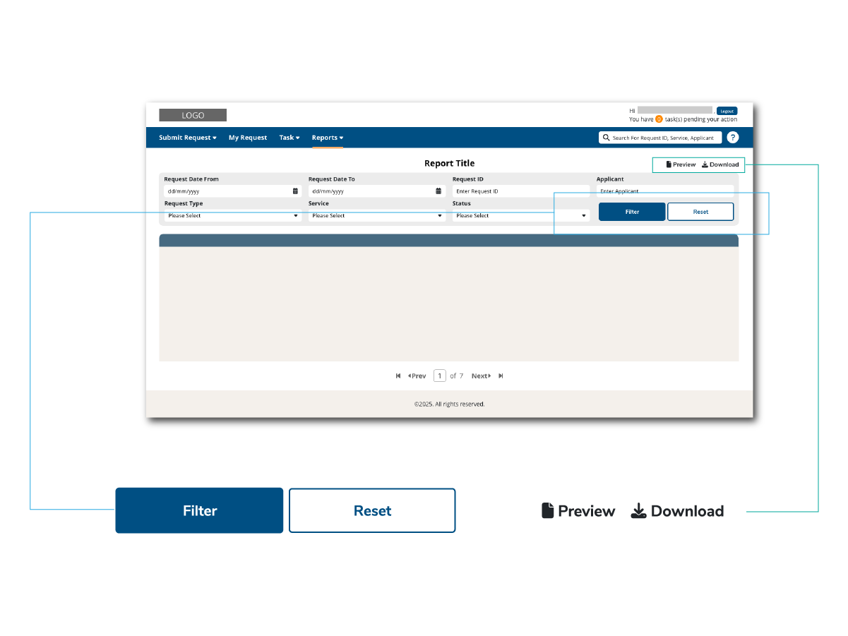
Multiple button groups on a single screen can create confusion, so I applied distinct visual treatments to differentiate them.
-
For the Filter group, I used the primary (blue background with white text) and secondary (blue border with white background and blue text) button styles. To match the reading flow of filling inputs, the primary button is placed on the left.
-
For the Action group, I adopted icon and text buttons without a background, consistent with familiar patterns from applications like Microsoft Office. This separation makes it easier for users to distinguish between filtering actions and page-level actions.
Takeaway
A consistent button system reduces hesitation and improves efficiency. By establishing hierarchy, ensuring accessibility, and standardizing placement, I made actions across applications more predictable and easier to complete.