
Chinese Tuition Center Website
Created by: Figma
Contributions
Research
Information Architecture (IA)
Sketching
Prototyping
Usability Test
Role
UX Designer
Background
The company was preparing to launch a brand-new Chinese tuition center, but as with any new venture, one big question remained: what do parents really look for when choosing a tuition provider for their children? To answer this, I initiated a series of parent interviews to uncover their priorities, concerns, and expectations.
Note: This case study has been simplified and all sensitive information has been removed. The goal here is to showcase my design thinking and process rather than disclose business details.
Project Overview
With insights from the research, my task was to design a marketing website that would serve as the tuition center’s very first touchpoint with parents. The website needed to build trust, highlight credibility, and speak directly to what matters most to families.
The process began with understanding parents’ perspectives, then transforming those insights into design opportunities. Finally, I translated them into a clean, user-friendly website experience that positions the tuition center as reliable and approachable from the very first click.
Project Flow
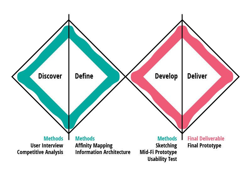
Research Objective
The research aimed to uncover parents’ real motivations and concerns when it comes to tuition. Through interviews, I explored three key areas: why parents send their children to tuition, what qualities they look for in a center, and what factors might discourage them from enrolling. These insights helped shape a clearer picture of parental decision-making and provided a foundation for designing a website that speaks to both their aspirations and their worries.
User Interview
I conducted user interviews with five parents who have children at the primary school level. These were casual, one-on-one conversations, each lasting around three to five minutes. The aim was to understand their perspectives on tuition — why they send their children, what they value most when choosing a center, and what might hold them back. Despite being short and informal, these conversations revealed valuable insights into parents’ real motivations and concerns, which later guided the design of a website that speaks directly to their needs.
Interview Questions
Does your child currently attend any tuition classes? If so, what were the main reasons behind that decision?
When considering a tuition center, what qualities or factors are most important to you as a parent?
What concerns or issues would prevent you from enrolling your child in a particular tuition center?
Insights
1) Parents want their kids to be in good hand
2) Parents want their kids to have better results / remain competitive
3) Parents want minimum travel time
4) Parents want to know the progression of their kids
5) Parents want to find a cost efficient tuition centre
6) Parents want their kids to be able to cope with school work
Parent Decision Journey
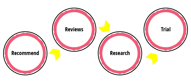
From the interviews, I discovered that parents follow a simple but consistent path when searching for a tuition center. They usually start with recommendations, look for reviews/testimonials to build confidence, do some research to compare options, and finally prefer a free trial before making a decision.
Competitive Analysis
After interviewing parents, I reviewed five direct competitors to see how they position themselves online. I focused on features parents said mattered most. These findings guided my design decisions to better align the website with what parents truly value.

Problem Statement
Parents need a tuition center they can trust to provide quality teaching, track their child’s progress, and support academic success — while remaining convenient and affordable.
Solution Statement
I believe that by designing a website that highlights credibility, learning outcomes, progress tracking, convenience, and value, we can reassure parents and help them confidently choose the tuition center.
Persona 1

“I just want to know my child is in good hands and making real progress.”
Amy is a mother of a Primary 4 student. She works full-time and wants her child to stay ahead academically. She values structured learning and proven results when choosing tuition.
Name: Amy Tan
Gender: Female
Age: 40
Location: Singapore
Goals
Ensure her child achieves strong academic results
Find a reputable center with experienced teachers
Track her child’s learning progress
Pain Points
Hard to assess the quality of teaching before enrolling
Limited visibility of her child’s progress after joining
Overwhelmed by many tuition options online
Persona 2

“I don’t need the fanciest program — I just need something nearby and effective.”
Ben is a father of a Primary 3 student. He is cost-conscious and prioritizes convenience when choosing tuition. While he wants good results, his main concern is balancing cost, location, and his child’s ability to cope.
Name: Ben Lee
Gender: Male
Age: 45
Location: Singapore
Goals
Find a tuition center close to home
Ensure tuition supports schoolwork without overloading the child
Access practical information quickly (class size, location)
Pain Points
Concerned about wasting time on long commutes
Uncertain whether classes are suitable for his child’s level
Information Architecture
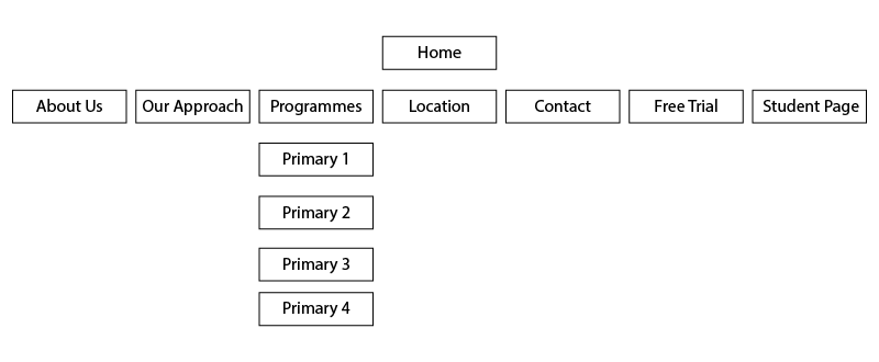
Given the business priorities and direction from upper management, I aligned the sitemap with a structure that parents were already familiar with from competitor websites: Homepage, About Us, Our Approach, Programmes, Location, and Contact. Rather than spending time on card sorting, I chose to prioritize speed and consistency with business goals. My plan was to validate this decision later through usability testing to ensure it also worked well for parents.
Mobile First Approach
From the interviews, I learned that parents usually start their research on mobile, then move to desktop for deeper exploration. This insight guided me to take a mobile-first approach, making sure the website creates a strong first impression on mobile while supporting detailed use on desktop.
Lo-Fi Prototype
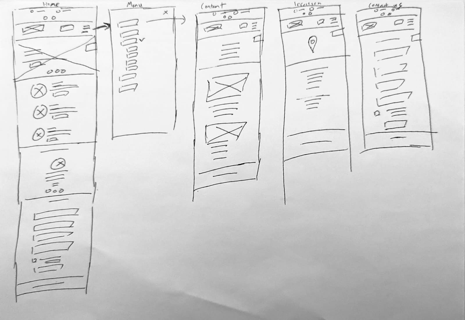
Using insights from interviews and competitive analysis, I sketched the low-fidelity prototype with a focus on clarity and usability. I placed contact information in the header and added a WhatsApp chat feature, since parents were already familiar with this when looking for other services online. The homepage was structured as banner → unique selling points → testimonials → contact form, creating a natural flow toward enquiry.
I positioned the student portal login in the fixed header for easy access by existing parents. For the Location page, I went beyond just listing the address by adding details like the nearest MRT and Bus Interchange to make it more useful. Finally, I chose to separate Contact and Location pages, aligning with business requirements and preparing for future expansion.
Mid-Fi Prototype
After gaining clarity from the sketches, I translated the layout into a mid-fidelity prototype. At this stage, my focus was on usability rather than visuals. The goal was to create an interactive version of the design that users could click through, allowing me to test navigation flow and content clarity before refining the details further. This helped me validate early design decisions and identify areas that needed adjustment before moving into high-fidelity.
Note: For the purpose of this case study, the iteration process has been simplified to highlight my thought process rather than every design change.
Click  on the right to view on full screen
Usability Test Insights (Mid-Fi Prototype)
To validate the mid-fidelity prototype, I ran small usability tests with three parents in each round. The sessions were simple and task-focused, designed to see if parents could easily navigate the site and find the information most important to them.
I asked them to complete key tasks such as accessing the student portal, checking class size, browsing programmes, finding directions, contacting the center, and signing up for a free trial. My thought process was to focus on the decision-making steps parents had emphasized during interviews, ensuring the design truly supported their needs and removed uncertainty.
Pros
“Navigation is straightforward and direct”
“The information on the location page will be helpful in finding the place.”
“Programmes are laid out clearly”
“Contact information is clearly shown on every page”
Cons
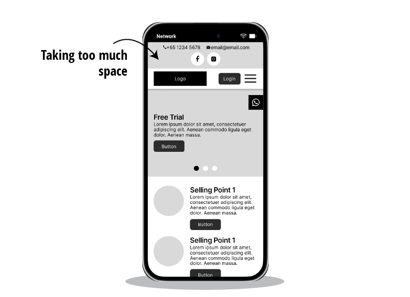
From the usability testing, I gathered several useful insights that shaped the design refinements. Parents felt that the contact information in the fixed header took up too much space, so I decided to replace the full details with phone and email icons. On mobile, this allows parents to tap and call or email instantly, while keeping the header clean.
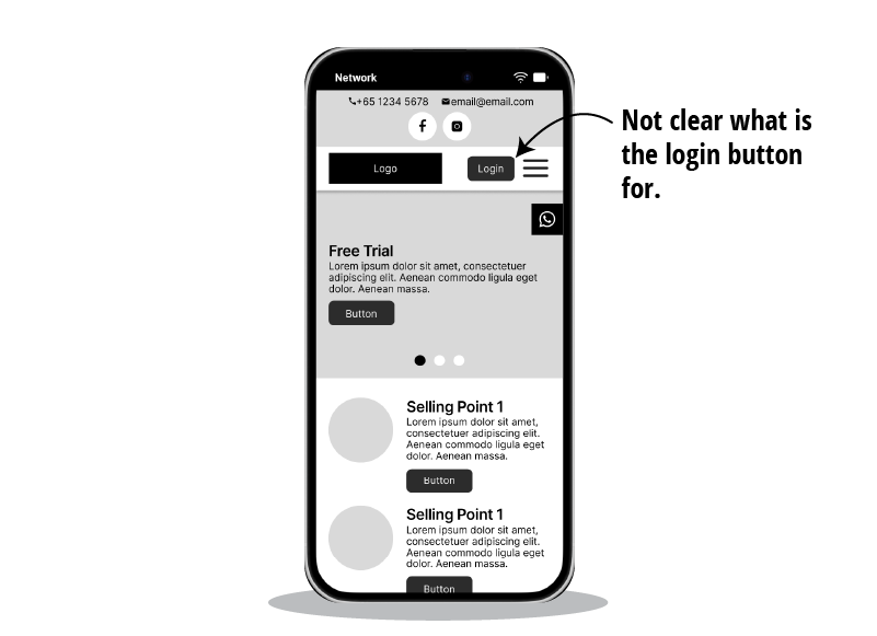
Another point of confusion was the login button, which wasn’t clear in its purpose. To make it explicit, I renamed it to “Login to Student Portal.” Since parents often browse with one hand on mobile, I also considered fixing key action buttons at the bottom of the screen for easier access.
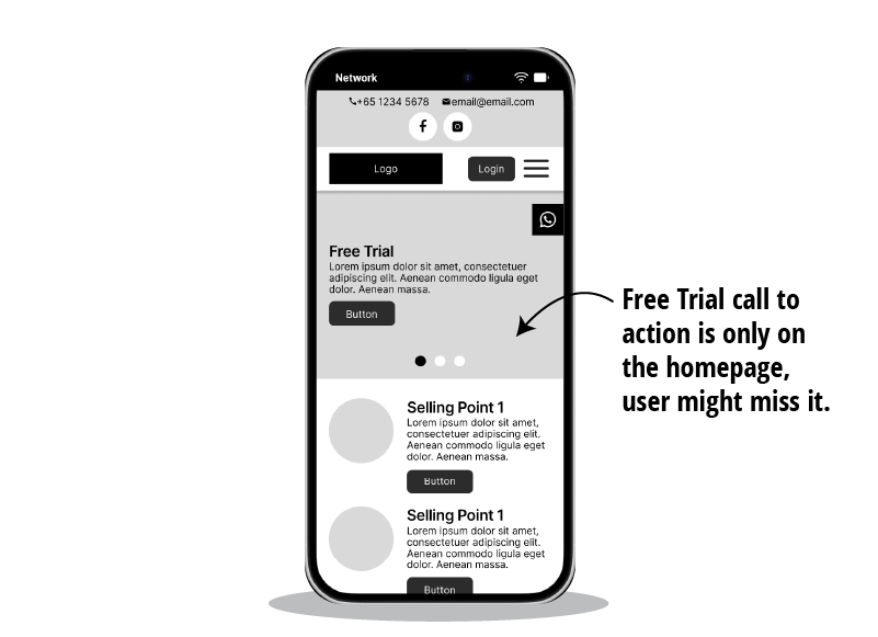
Parents also highlighted that the free trial was only visible on the homepage banner, which made it easy to overlook. To improve visibility, I proposed adding a fixed Free Trial button at the bottom, so it’s always accessible no matter which page they are on.
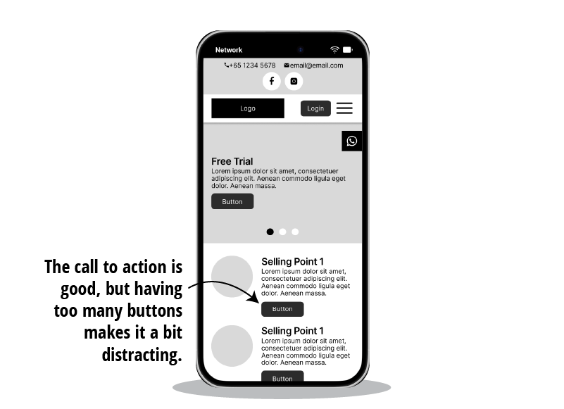
The feedback also mentioned that having too many buttons after each selling point felt distracting. To reduce visual clutter, I considered switching to subtle text links, making the navigation feel lighter.
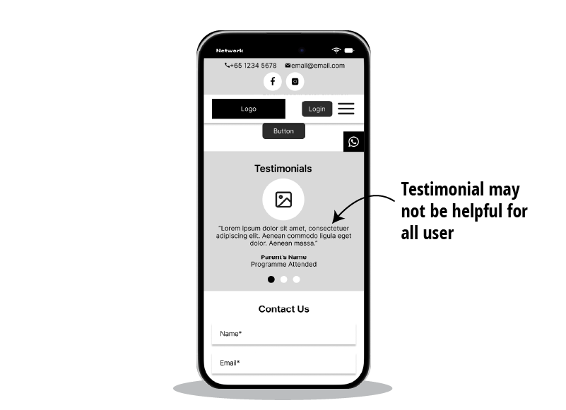
Another issue was that a combined testimonial section felt too generic. To make testimonials more relevant, I planned to split them across individual programme pages, so parents see feedback tied directly to the programme they are exploring.
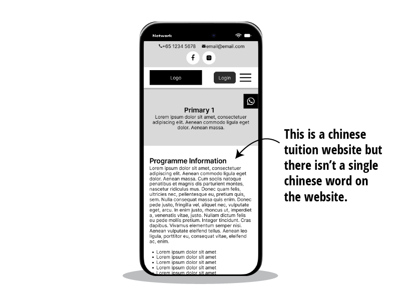
Lastly, parents mentioned that for a Chinese tuition website, there wasn’t a single Chinese word. To strengthen authenticity, I decided to add Chinese descriptions in key pages such as About Us, Our Approach, and Programmes, giving parents confidence in the tuition center’s Chinese standards.
Hi-Fi Prototype
With feedback from usability testing, I refined the design into a high-fidelity prototype. This stage focused on bringing in the visual identity and branding while ensuring the experience remained simple, trustworthy, and parent-focused. The hi-fi prototype combined both business goals and user needs, ready to be validated again before final development.
Click on the right to view on full screen
Usability Test Insights (Hi-Fi Prototype)
After refining the design into a high-fidelity prototype, I conducted another round of usability testing with parents. This time, the goal was not only to validate navigation and content but also to see how the final visuals and interactions affected clarity.
Parents were asked to complete the same key tasks as before — accessing the student portal, checking class size, browsing programmes, finding directions, contacting the center, and signing up for a free trial — but now within a polished interface. My thought process was to ensure that branding and visual details enhanced the experience without adding friction. The test confirmed the site’s usability, though some parents shared feedback on the colour choices, which I noted for further refinement.
Pros
“I can easily find the Student Portal login button and have no problem clicking on it”
“After reading the programme information, I can read reviews from other parents whose kids attended that programme.”
Cons
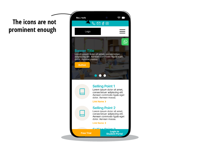
From the usability testing this time, I received feedback that the header icons were not prominent enough. To address this, I considered adding a background behind the icons to make them stand out more clearly.
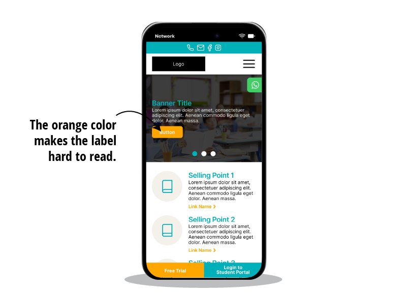
Another issue was that a combined testimonial section felt too generic. To make testimonials more relevant, I planned to split them across individual programme pages, so parents see feedback tied directly to the programme they are exploring.
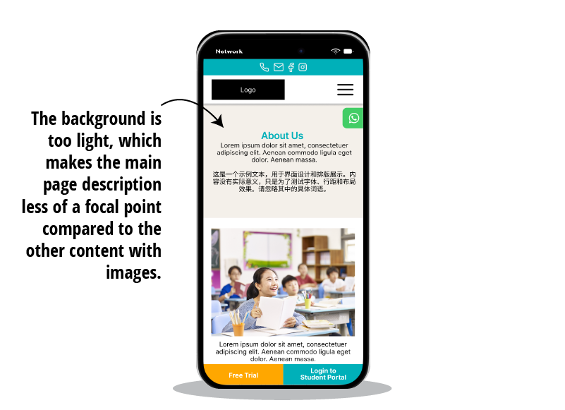
Finally, the content page descriptions felt too light and were overshadowed by sections with images. To give them more presence, I planned to introduce a dark background, ensuring these sections hold equal visual weight.
Final Prototype
Based on the feedback gathered from usability testing, I refined the mockups further to address clarity, readability, and overall usability. In parallel, I also designed the desktop version (not shown in this case study) to ensure consistency across devices as part of the ongoing iteration process.
The result is the final mobile prototype, shaped through multiple rounds of testing and refinement. This version represents a balance between business requirements and parents’ real needs, creating a clear, trustworthy, and accessible experience from the very first interaction
Click on the right to view on full screen
Result
Through multiple rounds of research, prototyping, and usability testing, the project produced a final mobile prototype that aligned with business goals while meeting parents’ real needs. The design delivers clear navigation, easy contact options, relevant testimonials, and a stronger visual hierarchy — all helping to build trust and confidence in the tuition center.
After launch, the website has proven effective in driving engagement. The business has been consistently receiving enquiries through the contact form, phone calls, and WhatsApp messaging, confirming that the design successfully supports parents’ preferred ways of reaching out.
While this case study has been simplified, it demonstrates how user insights and iterative testing can shape a website into a parent-focused, trustworthy, and easy-to-use platform. The final design lays a solid foundation for future development and potential expansion.
Key Takeaways
Looking back at the project, a few important lessons stood out. The first is that trust is the biggest factor for parents. From testimonials to clear communication, every design decision needed to reassure them that their children would be in good hands. My thought process was always to ask: “Does this feature help parents feel more confident?”
Secondly, I learned that simplicity often wins over complexity. During usability tests, parents felt overwhelmed when too many buttons or visual elements competed for their attention. This made me refine the design toward a cleaner, lighter interface, proving that less can indeed be more.
Another key takeaway is the importance of transparency. Parents wanted practical information upfront — class size, location details — instead of having to dig for it. This insight shaped my approach to information hierarchy, making sure essential details were always easy to find.
Finally, I realized that balancing business goals with user needs is critical. For example, separating the Contact and Location pages was a decision guided by business requirements, but I refined the execution so it still served parents effectively. My thought process here was to see design not just as user advocacy, but as the bridge between user expectations and business direction.