
Content Hierarchy
I applied content hierarchy principles across multiple modules in the web-based applications I worked on, including detail pages, listing pages, and navigation menus. These screens often contained dense information that risked overwhelming users. My goal was to establish a clear hierarchy that guided scanning and highlighted the most important elements at a glance.
Decision & Rationale
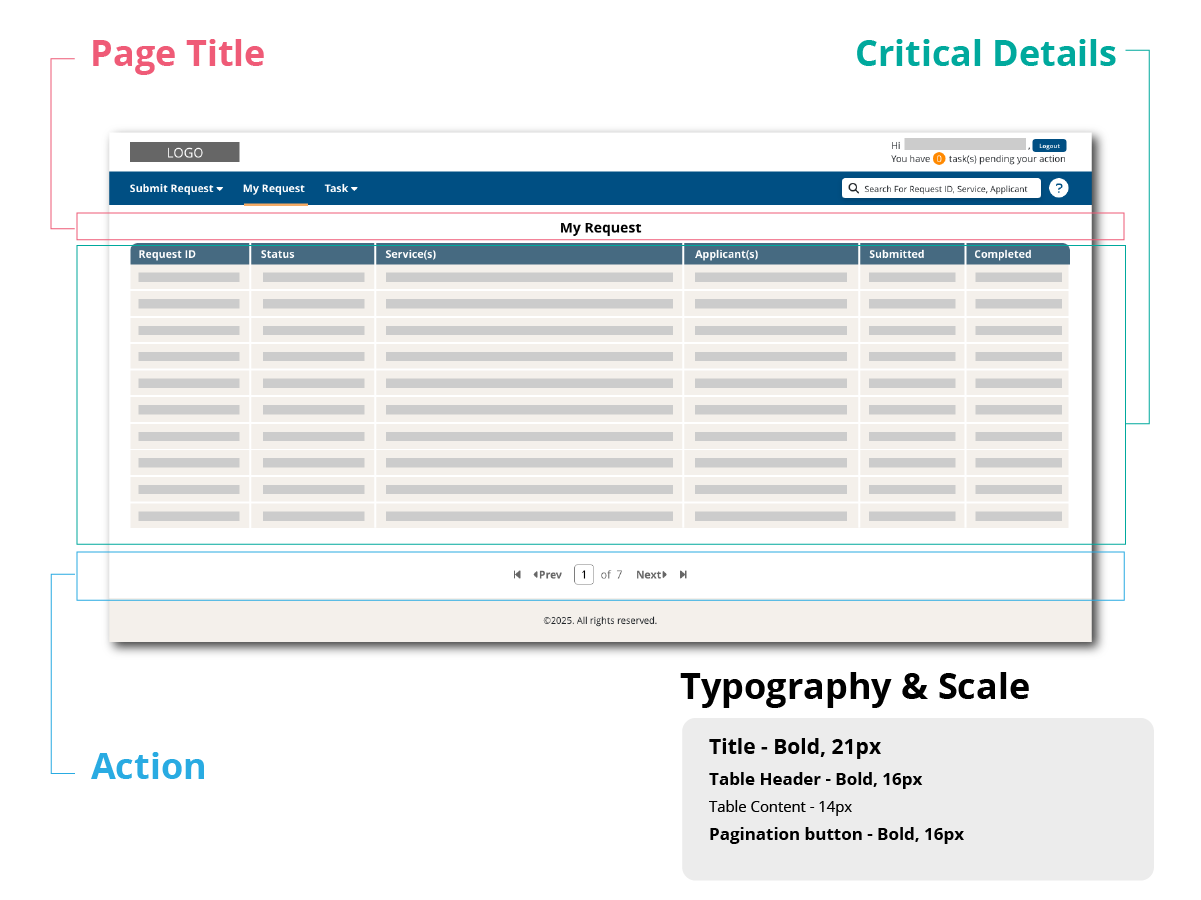
1) Request Access Application – Listing Page
-
Positioned the page title at the top, using a larger, bold font so users can immediately recognize where they are.
-
Organized critical details in a structured table. To establish hierarchy, the table headers use a larger font size than the table content.
-
Placed pagination at the bottom of the page, aligning with user behavior since it is typically accessed after reviewing the table content.
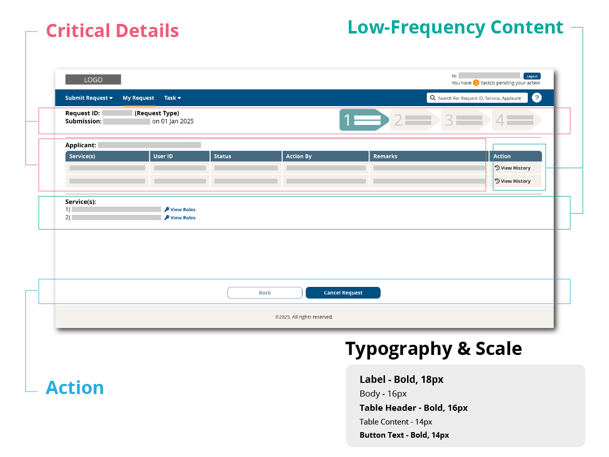
2) Request Access Application – Detail Page
-
Positioned critical information (submission details, current stage, and request details) at the top to ensure immediate visibility.
-
Presented request details in a table format for improved readability, with larger header text to reinforce hierarchy.
-
Minimized clutter by hiding low-frequency content behind a toggle, allowing users to focus on key details first.
-
Placed action buttons at the bottom of the page, aligning with user behavior of reviewing details before taking action.
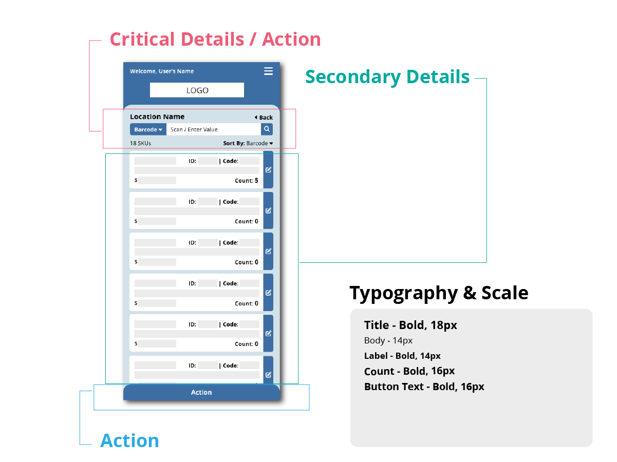
3) Stocktaking Application – Detail Page
-
Placed critical details and actions (location name, total number of products, back button, input field for scanning, and sort function) at the top for immediate visibility.
-
Used a larger font size for the location name to help users confirm they are stocktaking in the correct location.
-
Displayed product listings in a card format, with the count number emphasized in a larger font to highlight the core purpose of the application: tracking quantities.
-
Positioned the primary action button at the bottom of the screen, making it thumb-accessible for mobile users.
-
Aligned all action buttons to the right, accommodating right-handed phone use while the left hand operates the scanner.
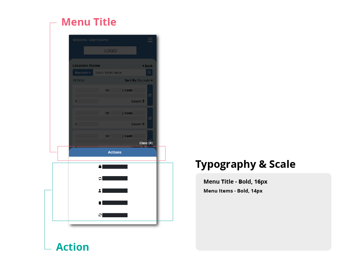
4) Stocktaking Application – Menu
-
Placed the menu title at the top with a larger font size to establish clear hierarchy and orientation.
-
Center-aligned the menu items so that, regardless of their length, users can comfortably reach them with their thumb.
Takeaway
Effective content hierarchy ensures that critical details stand out rather than getting lost in clutter. By applying a consistent type scale and grouping strategy across modules, I improved scanability, reinforced predictability, and enhanced clarity across multiple applications.