SingHealth Polyclinics
Service Design
Created by: Figma
(HealthBuddy Application)
Contributions
Research
User Interview
Contextual Inquiry
Sketching
Prototyping
Business Origami
Usability Test
Role
UX Researcher
Background
SingHealth is Singapore’s largest group of healthcare institutions. They gets up to 2 million calls each year! Hence they are trying to solve this problem by coming out with Health Buddy, an application that allows patients to book appointment online for polyclinics and check queue updates.
Project Overview
We work in a group of 3 to improve the current HealthBuddy application and also try to ease everyone’s journey in polyclinics.
By the end of 10 days, we will be presenting our solutions and show how they meets the needs of our target personas and align with the goals and brand of the SingHealth.
Project Flow
Expert Review

The following are the problems observed after testing out the application:
1. The booking process is long and take us a while to figure out where to click.
2. Excessive scrolling when selecting a date for appointments.
3. Lack of transparency with regards to queue status.
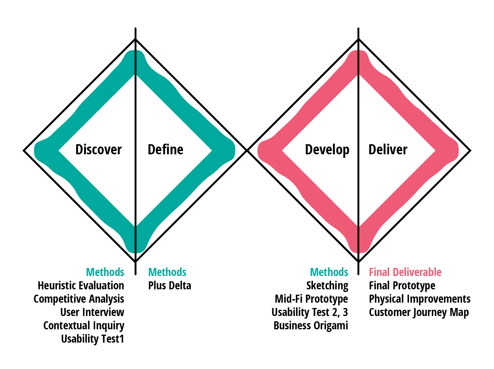
Competitive Analysis
We compared the features of 5 direct and indirect competitors.
In general, most of them has a consistent layout. Some features that we think that are good and can be added to the HealthBuddy application are calendar style booking system, appointment notification and chatbot function.
User Interview
We conduct user interview with 5 participants that have visited polyclinics before.
The purpose is to find out their experience at the polyclinic.
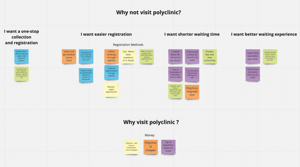
The following are the insights:
- Users want a one-stop collection and registration point.
- Users want an easier registration method.
- Users want a shorter waiting time.
- Users want a better waiting experience.
- Users visit polyclinic because it is cheaper than private clinic.
Contextual Inquiry + Interview
We visit the Outram Polyclinic to understand and experience the whole process from registration to payment. We also manage to interview some patients to find out about their experience at the polyclinic.
Insights
1. The estimated time on the slip is different from the estimated time given by the staff.
2. Patients do not understand why their queue jumped.
3. Patients will wait for at least 45mins and do not wish to move around as they are afraid to miss their queue.
4. Some of the patients do not know that they will need to drop the prescription at the pigeon hole before they can collect the medicine.
5. Patients rarely use the application for payment.
6. Lack of awareness of the HealthyBuddy app.
7. Patients wish to have drinks or snacks while waiting.
8. For existing HealthBuddy app users, they find the application convenient and help to reduce their waiting time.
Problems
Users need
1. Better waiting experience
2. Seamless journey in Polyclinic
3. Fast, convenient & easy appointment booking process
Solutions
1. Create awareness for HealthBuddy Application.
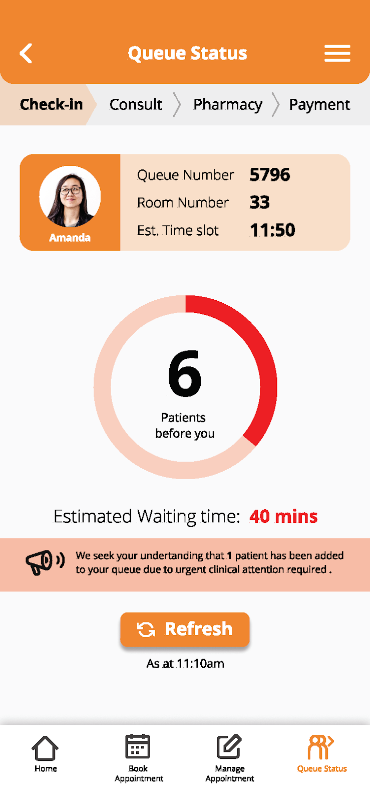
2. Better waiting experience for patients.
(queue status, drinks and snacks)
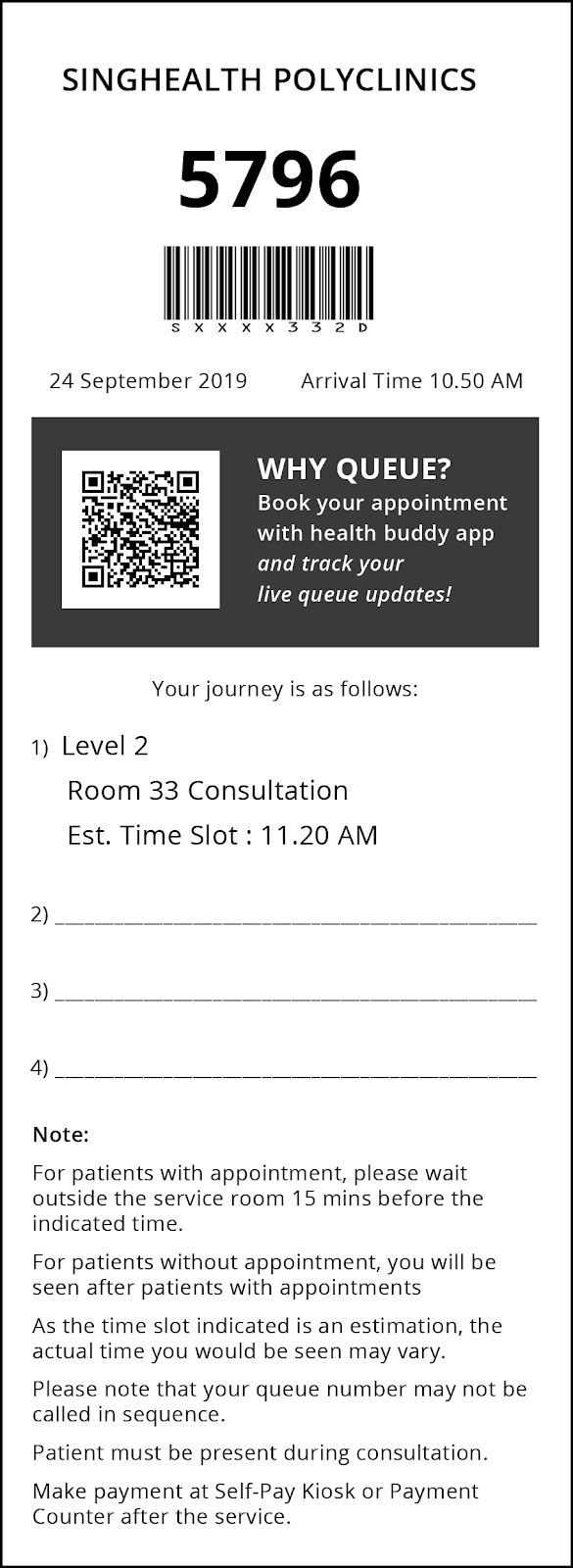
3. Patients know exactly where they need to go.
(on the applications & prescription form)
4. Improve booking process on HealthBuddy and ensure that first time user will find it easy to use.
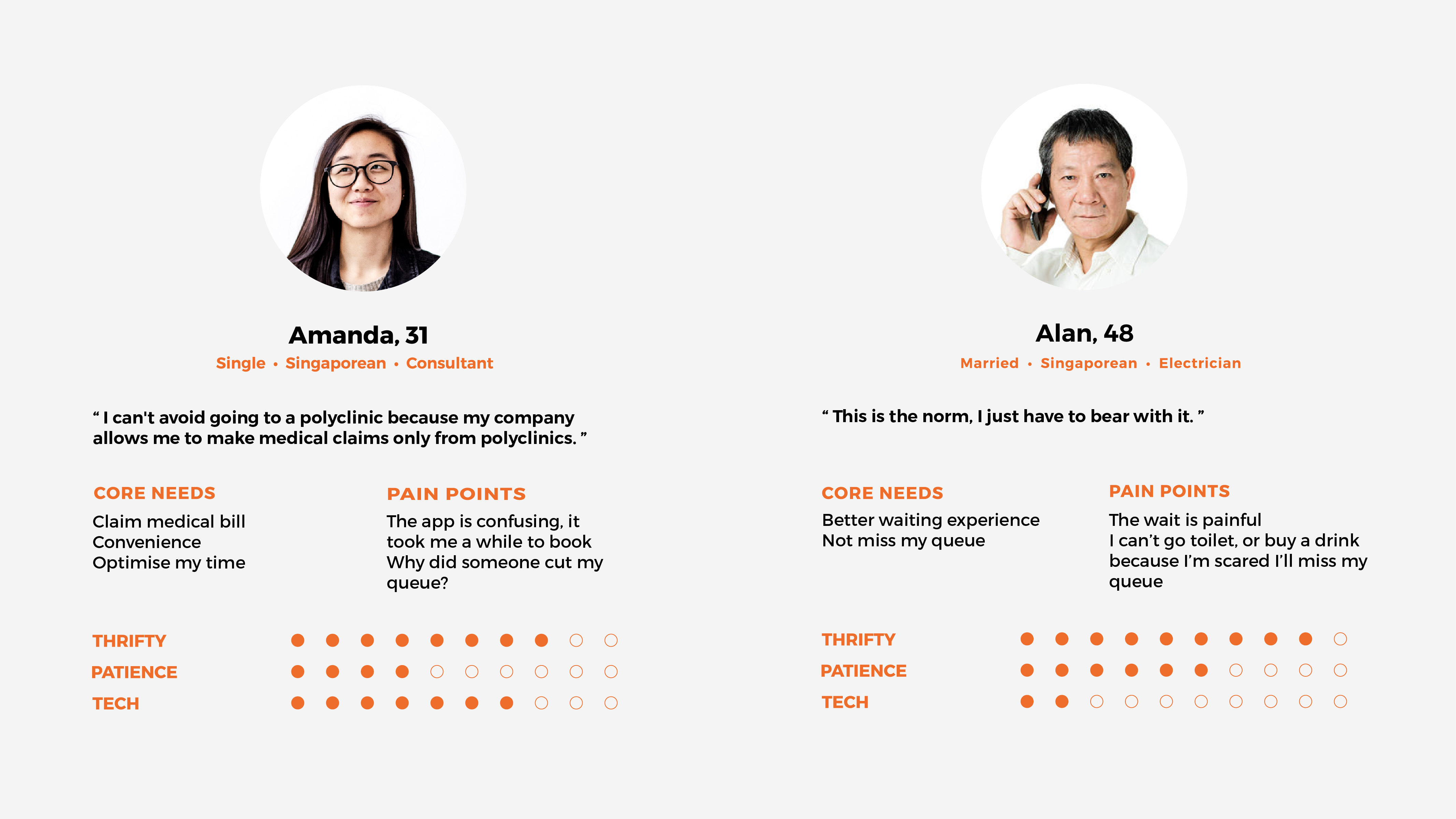
Personas
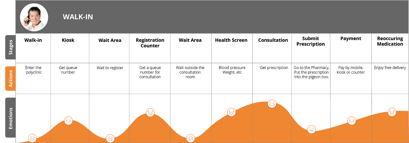
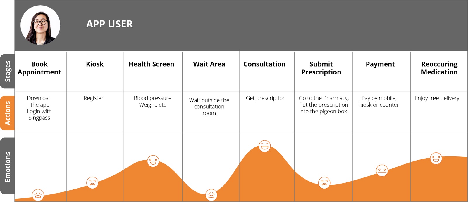
Customer Journey Map
Based on the contextual inquiry and interview, we come out with the following customer journey map.
Usability Testing
We conduct 3 rounds of usability test to gather users’ feedback and improve the prototype.
The following are some of the feedbacks and observations.
“Homepage layout is good! I can see all the functions at one glance.”
“Queue status function is good!”
” The flow is clear cut and application is easy to use.”
User misunderstood certain terms used.
User did not notice the book button.
User attempt to tap the whole appointment tab instead of the option button.
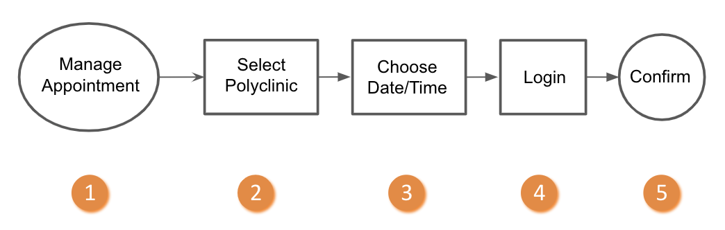
Booking Process
Current Booking Process

New Booking Process
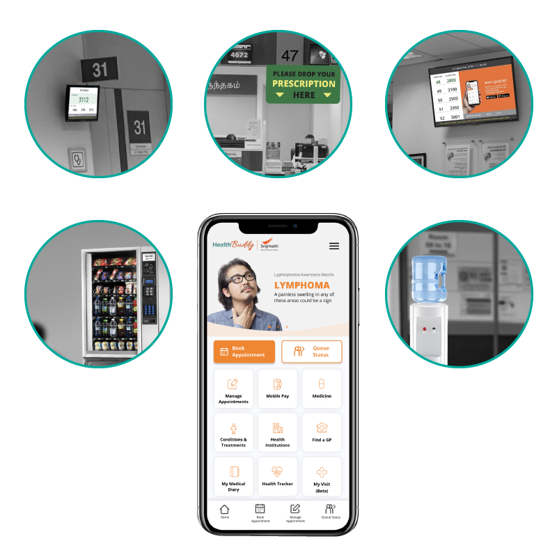
Physical Improvements
Create Awareness
Add advertisement to main TV screen
Edit advertisement on receipt
Improve Waiting Experience
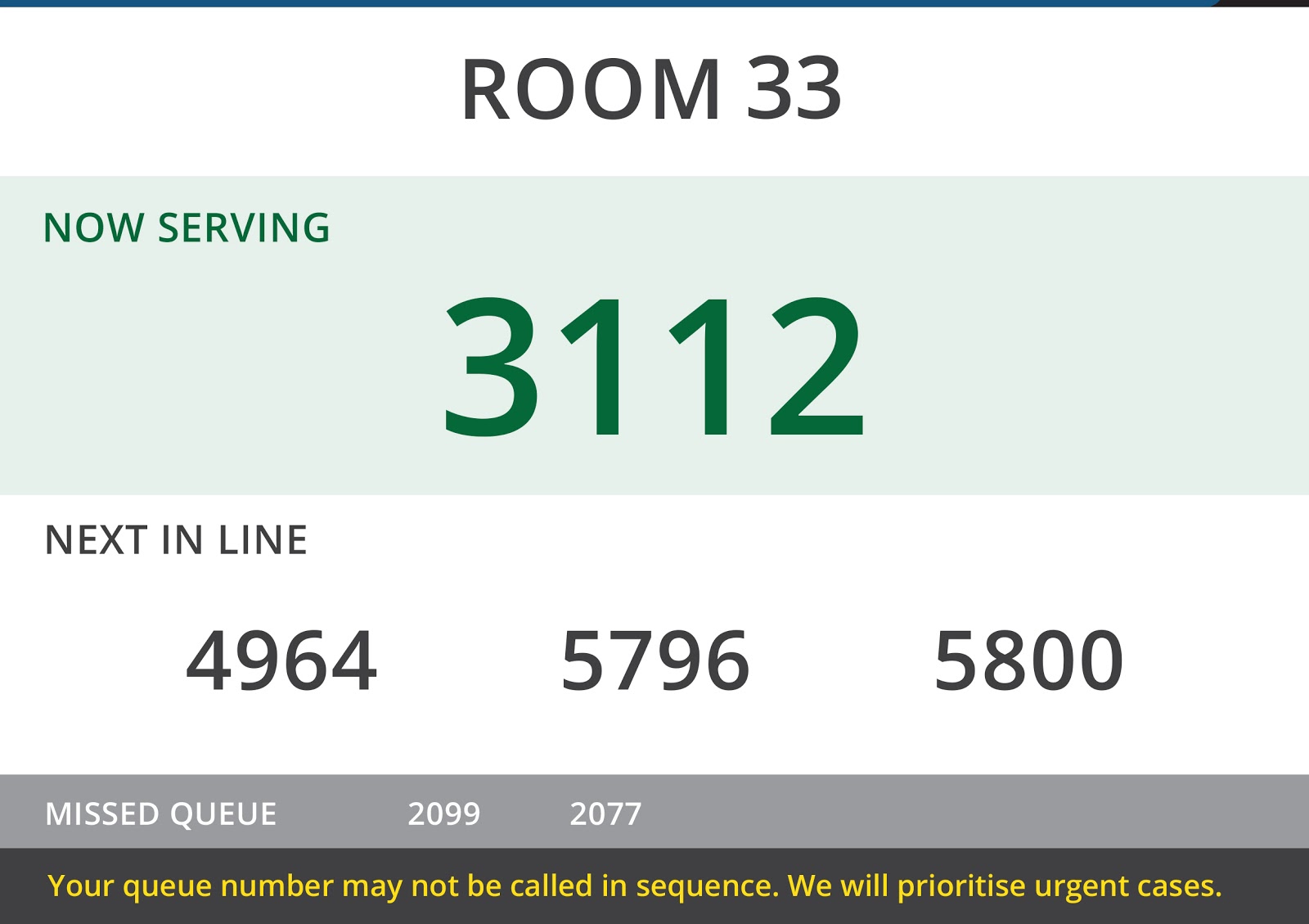
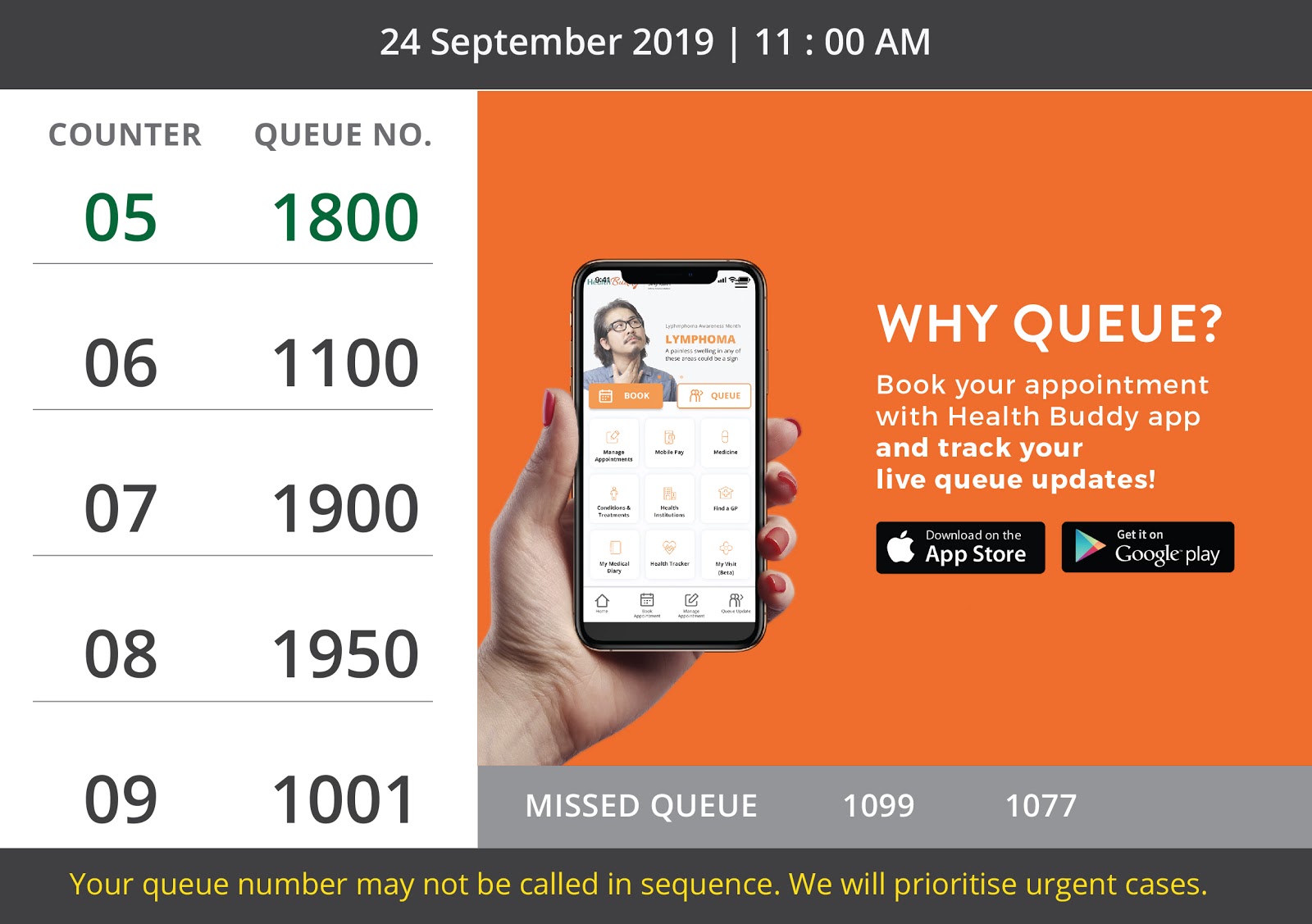
Display the next 3 queue number so that non-app user can estimate the waiting time
Explain to user why someone jump their queue
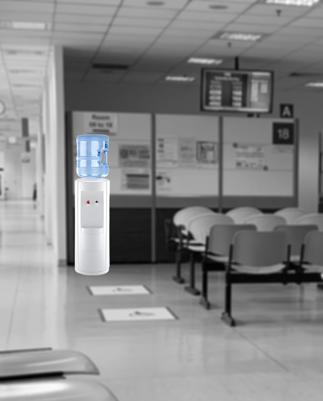
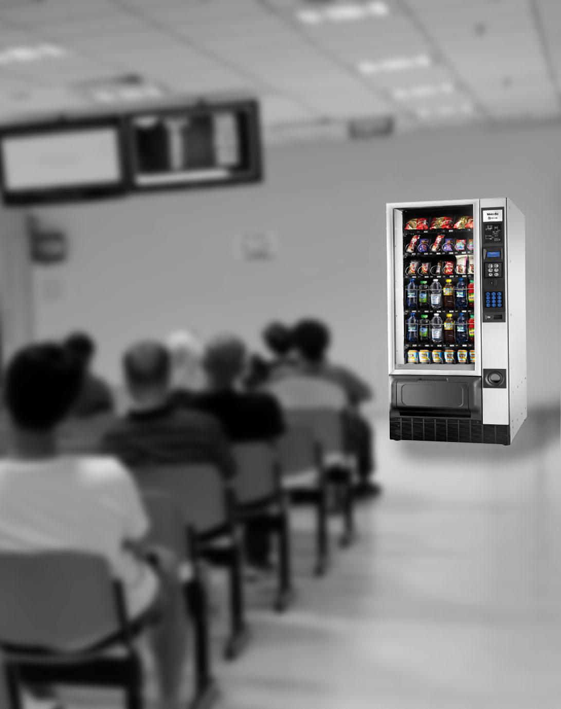
Add Water Cooler and Snack Machine to the waiting area
Clear Direction
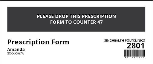
Add instruction to prescription form
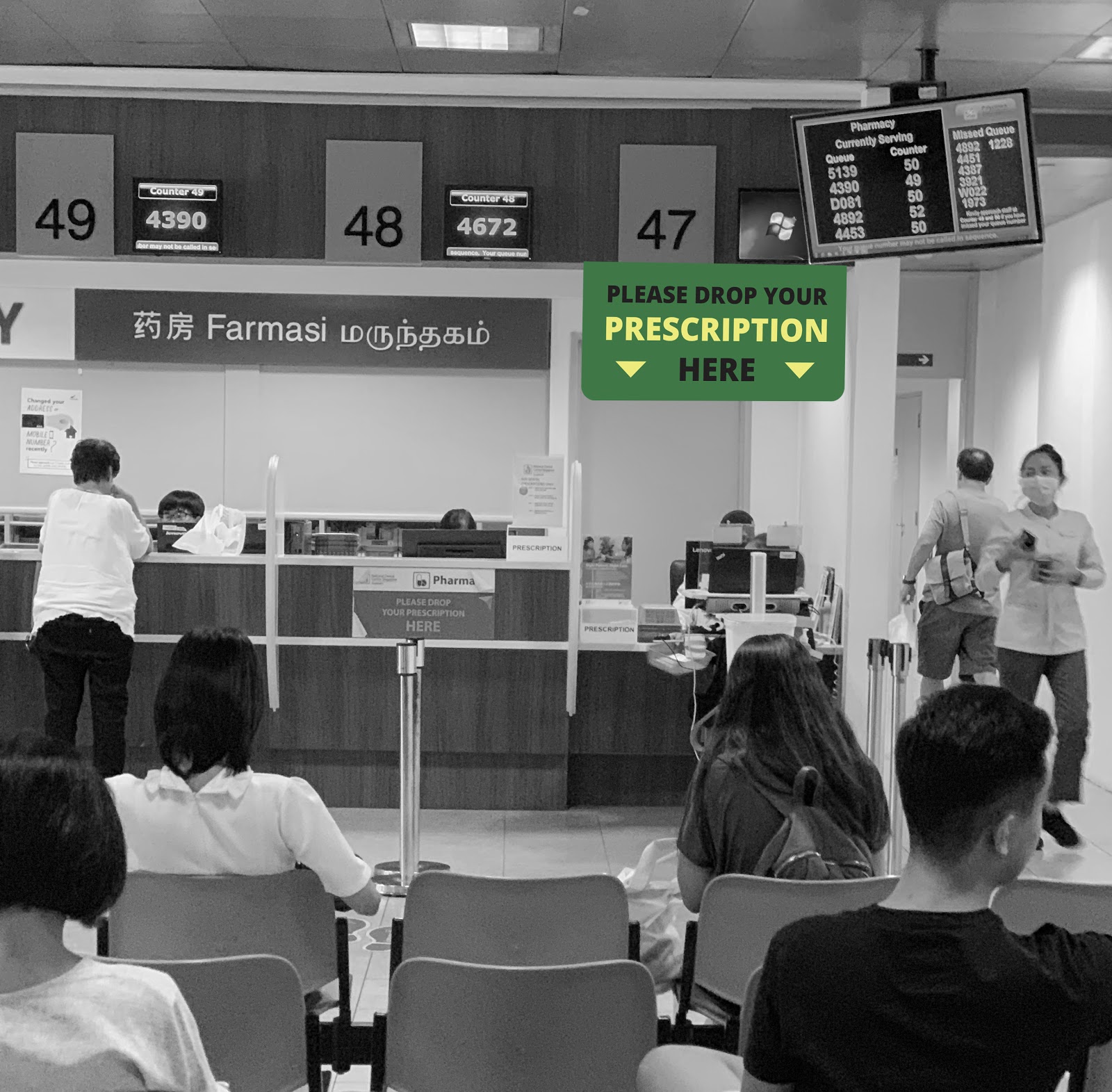
Clearer Signage
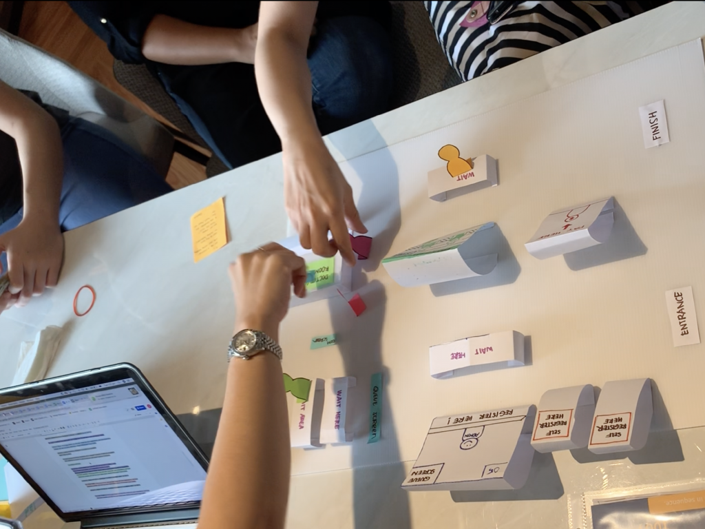
Business Origami
We test our solutions with 2 rounds of Business Origami (current vs improved) to find out if they really works.
The business origami is conducted in the form of a monopoly game. Each player has to go through all the 6 stations. They will be given a character card before the start of the game. Their mission is to get to the end point within the shortest time. To make the game more realistic, the players are not allow to communicate with each other. All the instructions from game master, questions and thoughts of players will be communicated through whatsapp. At the end of the game, all players help us to complete a NPS survey.

Insights (Round 1 vs Round 2)
Players have lesser complains and questions in round 2.
Players are happy with clear queue status update and notification explaining why someone cut their queue.
Players know exactly what to do at the pharmacy in round 2.
NPS Result
Based on the survey, we have improved the NPS from -20% to 30 %.