FoodBank Website
Created by: Figma
Contributions
Research
Card Sorting
Tree Testing
Information Architecture (IA)
Sketching
Prototyping
Usability Test
Role
UX Designer
Background
FoodBank SG is a warehouse that serves as a single collection and distribution point. This is a non-profitable organization.
Project Overview
We work in a group of 3 to redesign the Information Architecture (IA) and key pages layout of FoodBank Singapore.
By the end of 10 days, we will be presenting an interactive prototype showing how our design meets the needs of our target personas and align with the goals and brand of the FoodBank Singapore.
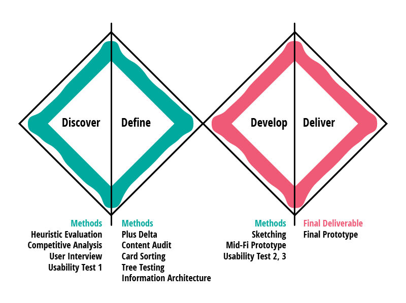
Project Flow
Research Objective
To improve the efficiency of the FoodBank website in order to enhance the users overall awareness in regards to donations and volunteering.
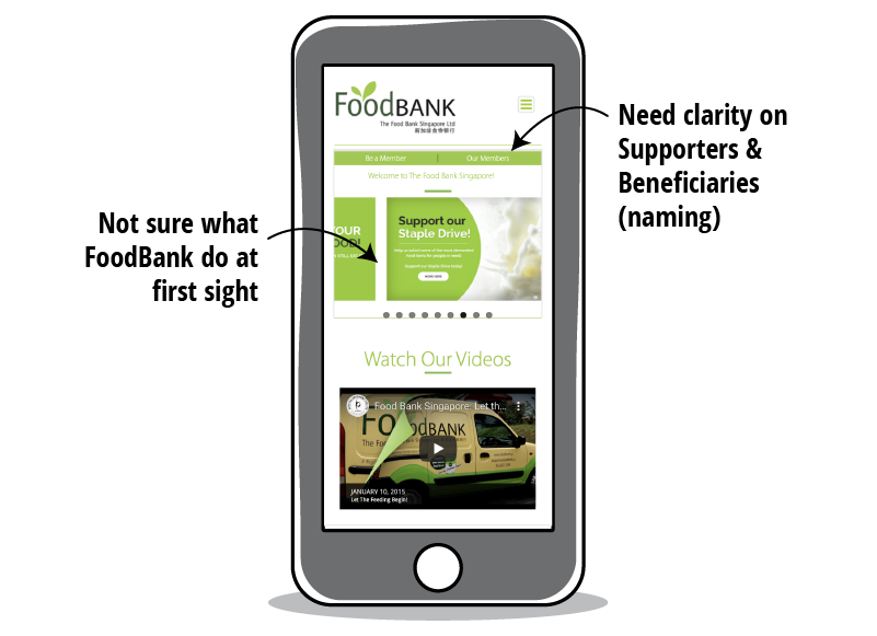
Expert Review
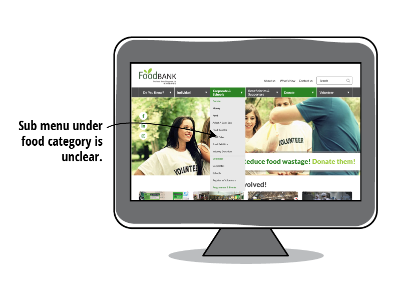
The informations that users are looking for are in the current website but the Information Architecture is bad. Users have difficulty accessing the information they need.
Users may not understand some of the terms used on the website.
Purpose Of The Website
We start off by looking at the purpose of the website so that we can focus on an area.
1. Create awareness of food wastage
2. Reduce amount of food wastage in Singapore
3. Receive food & money donations
4. Recruit volunteers, supporters to help their beneficiaries
Competitive Analysis
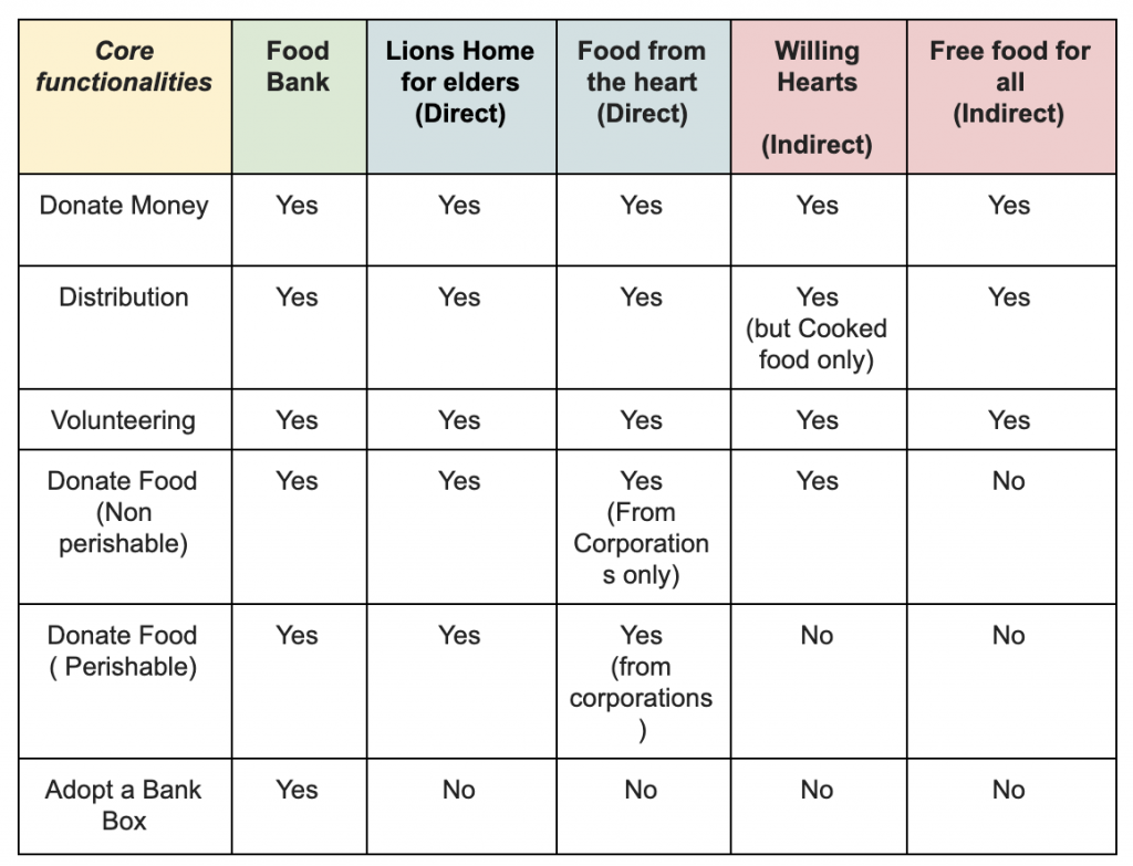
We did a competitive analysis with 5 direct and indirect competitors.
FoodBank Singapore (FBSG) has many direct and indirect competitors competing for donations and volunteers.
We need to focus on the 2 main groups of contributors (individual and corporates/schools) to give FBSG a more competitive edge.
User Interview
We conduct user interview with 5 participants that have either volunteer before or have the intention to donate their excess food. The purpose is to find out what they are looking for when volunteering or donating.
Interview Questions
Can you describe to me your last volunteering experience?
What information do you look out for?
Have you ever plan to donate your excess food?
Do you know how?
What information do you look out for?
Insights
Users will be interested in finding out what they can volunteer as well as the requirements for volunteering (skillsets, etc).
Users want to know exactly what they can donate (money, type of food, etc).
Users want to know where and how they can donate food items.
Usability Test 1 (Current Site) Insights
Pros
“The visual is good!”
“I can find the informations that I need but it took me a while to find them!”
“I can choose to contribute by donating money.”
“I know where I can go to drop my excess food. Will be good if there are photos to show me the exact location of the Bank Box.”
Cons
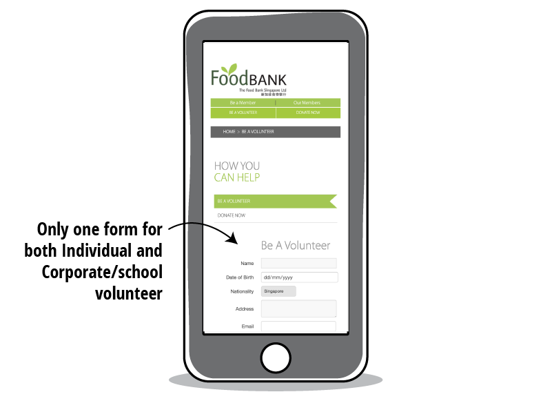
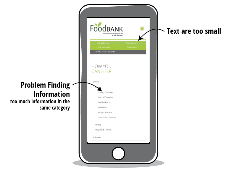
Problem Statement
Users need a more organized Food Bank SG website in order to get information on food donation and volunteering faster.
Solution Statement
We believe that by restructuring the information architecture of the website, we can reduce the time taken for users to gather information, hence giving FoodBank a more competitive edge.
Persona 1

“Let’s make the world a better place!”
Grace is busy during the weekdays but on her free time, she wants to spend a few hours volunteering at a charity organisation.
Name: Grace Tan
Gender: Female
Age: 30
Job: UX Designer
Location: Singapore
Goals
Volunteer during her free time
Well-organised volunteering session
Pain Points
Find a time slot that fits her schedule.
Gather informations of volunteering activities
Persona 2

“Oh no, I buy too much canned food again!”
Talor hates running out of food supplies at home so she will usually order in bulk. But very often she will not be able to finish them before they expire.
Name: Taylor Smith
Gender: Female
Age: 50
Job: Housewife
Location: Singapore
Goals
Find out where she can donate excess food
Feed the needy and contribute back to society
Pain Points
Find a time slot that fits her schedule.
Gather informations of volunteering activities
Persona 3

“What can my company offer to contribute back to society?”
In order to receive tax rebate for the company, John is tasked to find out what kind of Corporate Social Responsibility (CSR) they can offer.
Name: John Lee
Gender: Male
Age: 45
Job: HR Manager
Location: Singapore
Goals
Know what items to donate
Ensures that employees take part in the planned activities
Pain Points
Block a date for the CSR activity that fits into everyone’s schedule
Gather the requirements for a CSR
Content Analysis
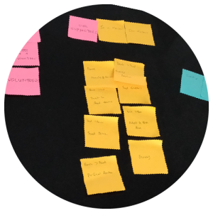
We did a content analysis to sort out the content currently on the website.
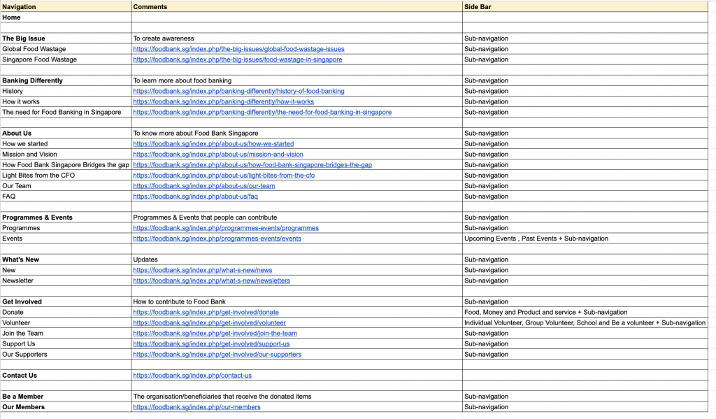
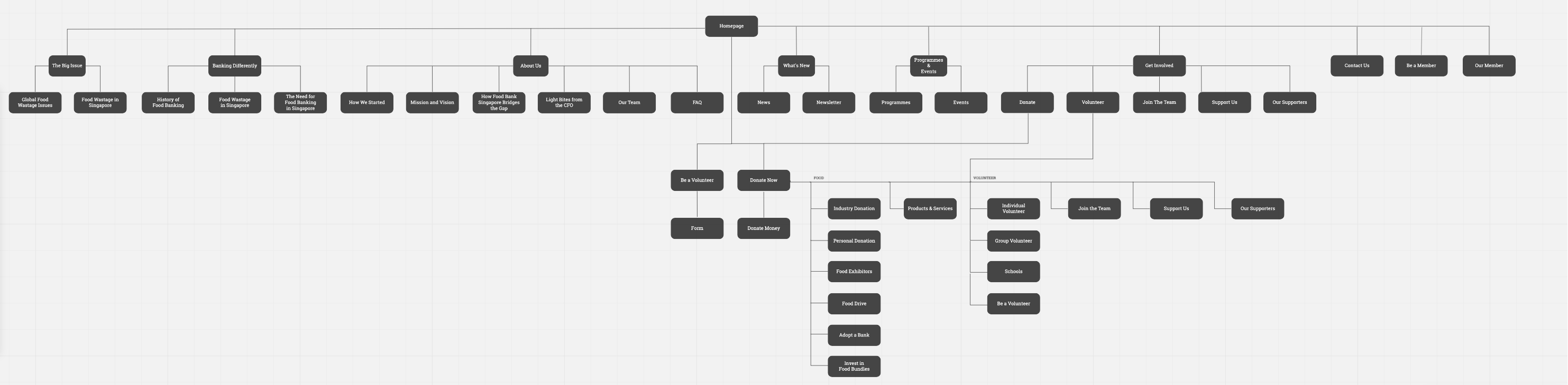
Current Information Architecture
We take a look at the current sitemap to have a better understanding on the flow.
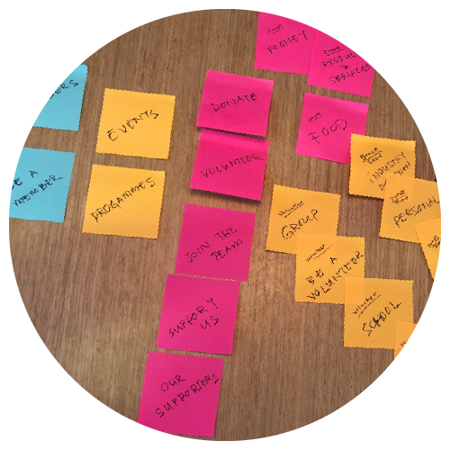
Card Sorting
We perform a card sorting exercise with 5 users to find out how they will categorise the items on the website.
The 4 categories that the users come out with are: Donate, Volunteers, Beneficiaries & Supporters and Programmes & Events.
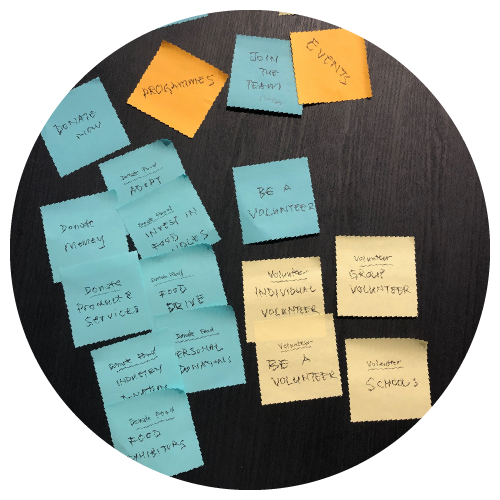
Information Architecture
Considering the result from the card sorting exercise, we come out with the following Sitemap.
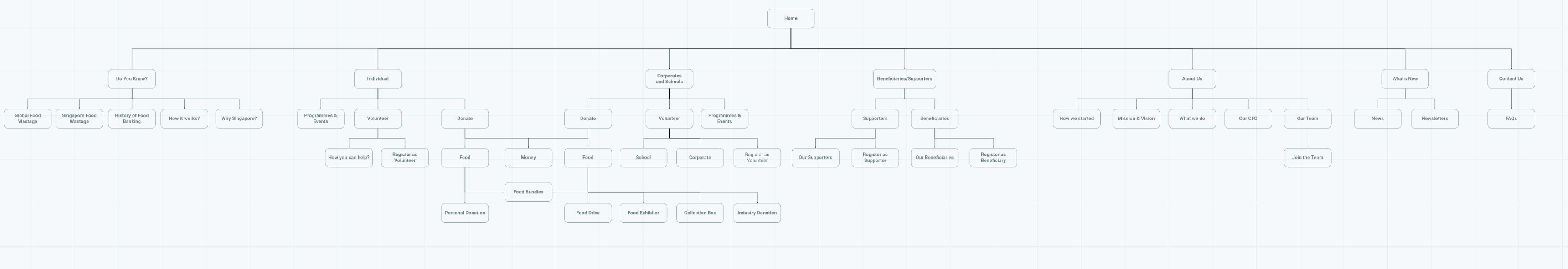
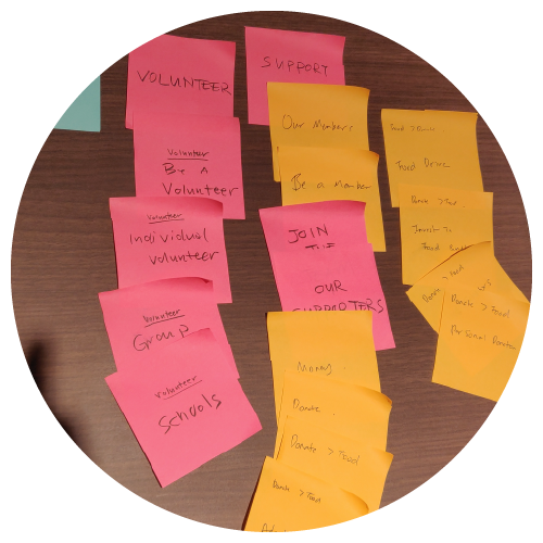
Tree Testing
We conduct Tree Testing with 10 participants to find out if our new Information Architecture works.
The participants are able to get to the end of the path for most test scenarios. The reason that the participants fail the test scenario is that they do not understand the terms. Instead of revising the terms used, we think that it might be better to educate the users.
Mobile First Approach
Desk Research
Statistics show that users consumed information more on mobile than desktop.
User Interviews
Most users that we have interview will prefer to research on their mobile first. After doing a quick search on their mobile, they go in depth or perform important task on desktop (eg. booking an air-ticket or filling up forms).
References
https://www.weqtechnologies.com/6-digital-marketing-trends-that-drove-2018-will-drive-2019
https://medium.com/@Vincentxia77/what-is-mobile-first-design-why-its-important-how-to-make-it-7d3cf2e29d00
https://gs.statcounter.com/platform-market-share/desktop-mobile-tablet
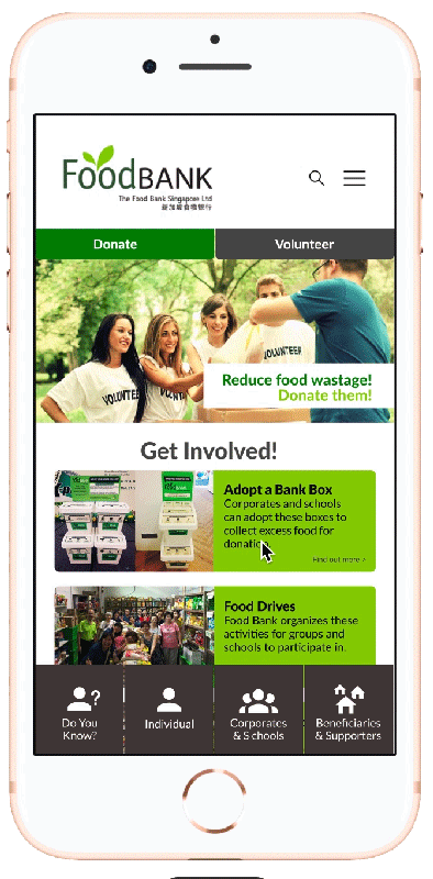
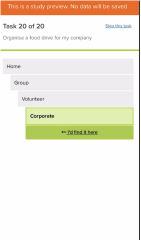
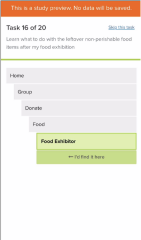
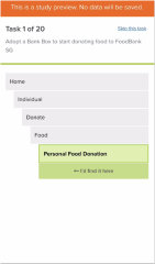
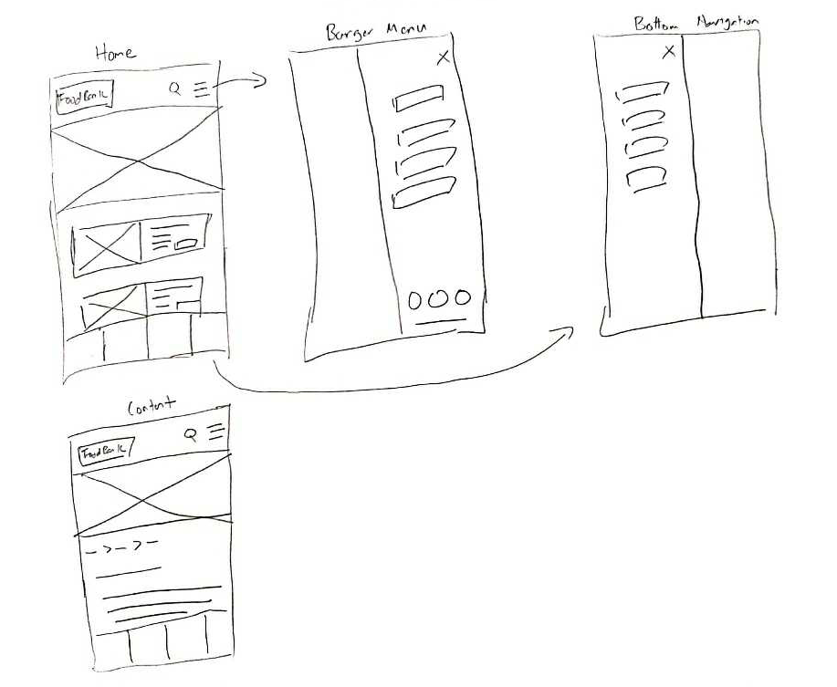
Lo-Fi Prototype
A rough sketch of the mobile site layout.
Mid-Fi Prototype
Click ![]() on the right to view on full screen
on the right to view on full screen
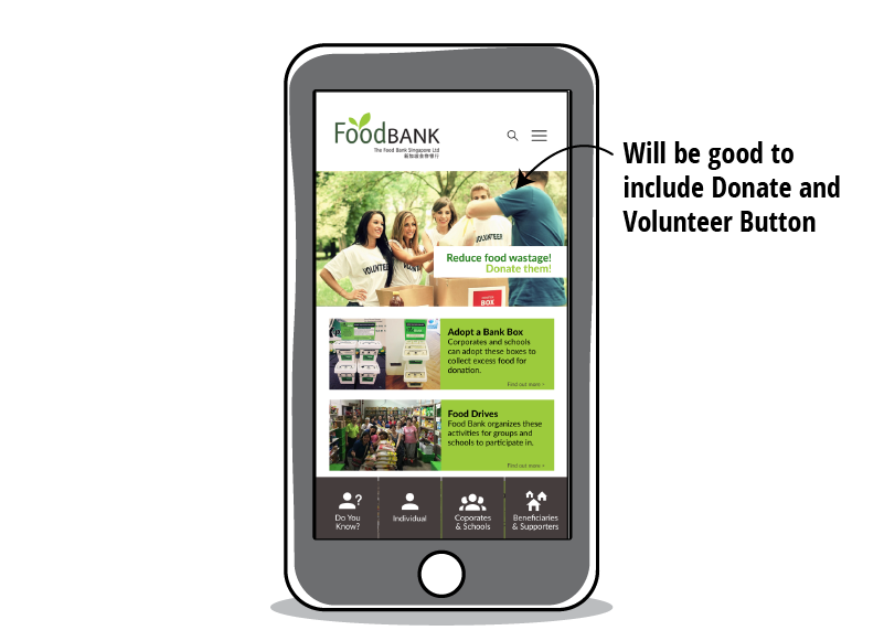
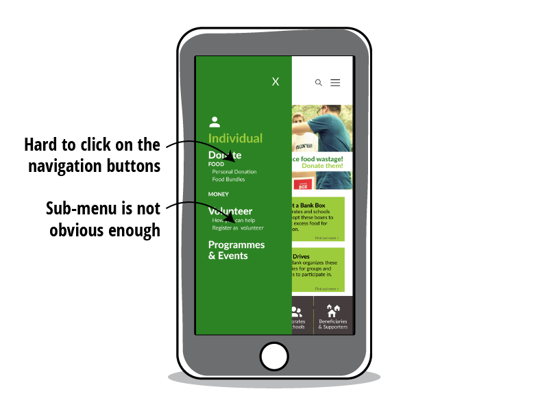
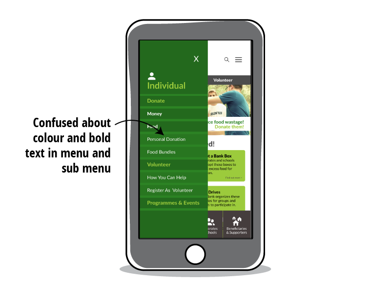
Usability Test 2 Insights
Pros
“The font is big enough to read.”
“The website is easy to navigate.”
“I can get the informations that I need easily.”
“I can roughly guess what FoodBank does when I am at the homepage.”
Cons
Mid-Fi Prototype 2
After Usability Test 2, we come out with the desktop prototype as well.
Desktop Prototype: Click Here
Click ![]() on the right to view on full screen
on the right to view on full screen
Usability Test 3 Insights
Pros
“The website is straightforward and easy to navigate.”
“I can find the informations that I need effortlessly!”
Cons
Final Prototype
Desktop Prototype: Click Here
Click ![]() on the right to view on full screen
on the right to view on full screen